health data by and for the people
the challenge
CareEvolution's technology enables healthcare organizations to give patients access to their information simply, securely, and efficiently across different systems, devices, and providers. After 20 years of steady and strategic growth, the time had come to expand their story so their products could support the changing healthcare landscape in ways that no one else can. and ways that the healthcare system desperately needed.
As the company shifted from custom solutions to self-service products, they needed a brand that would help their users understand how their products work together and the wide array of use cases they serve. But CareEvolution’s radically flat org structure—a feature of their success in innovation—required a design system that anyone could work with, whether they’re a software architect, data scientist, or hold a PhD in molecular biology.
what we made together
in a highly collaborative process with the careevolution team, the Proto team created an entirely new brand identity from strategy to marketing touchpoints.
brand strategy—including purpose definition, brand values and behaviors, high-level audience definition, and brand architecture
verbal identity—including brand voice, GTM messaging, copy bank, product naming strategy and generation, campaign marketing copy
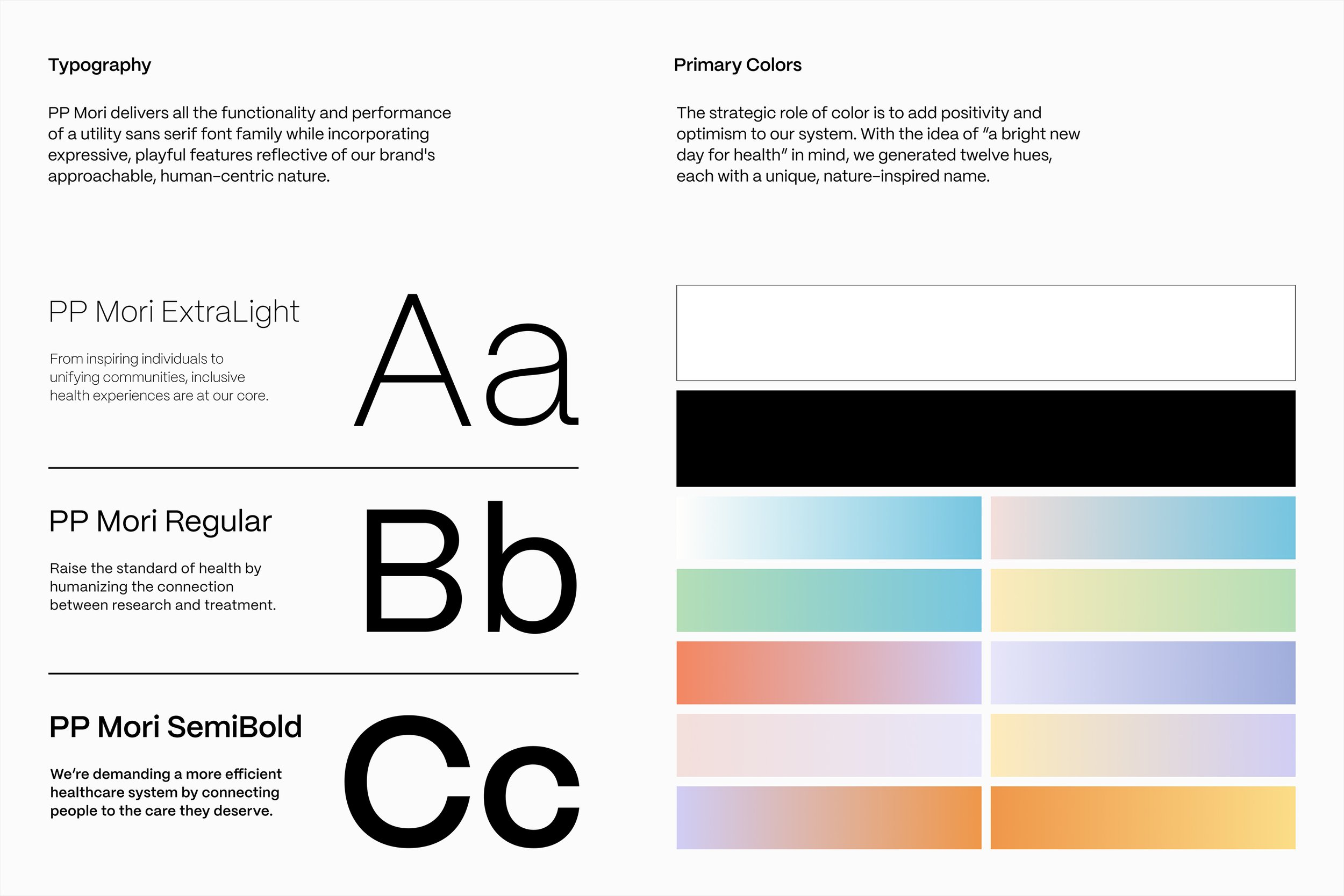
visual identity—color palette, icon set, UI elements, photography pov and stock library. motion design
generative tools—dial component creator, color gradient applicator, digital business card template, sales deck template
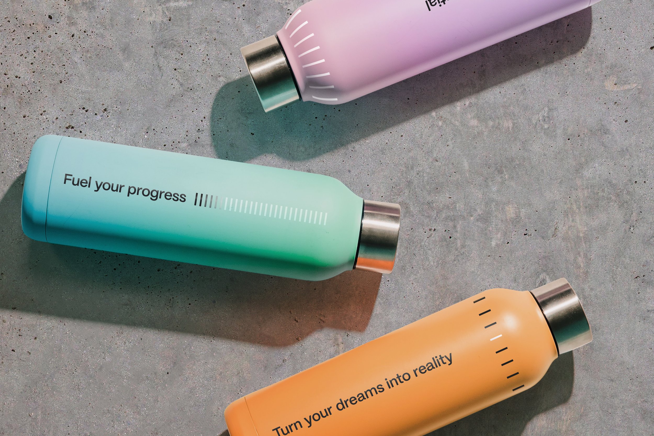
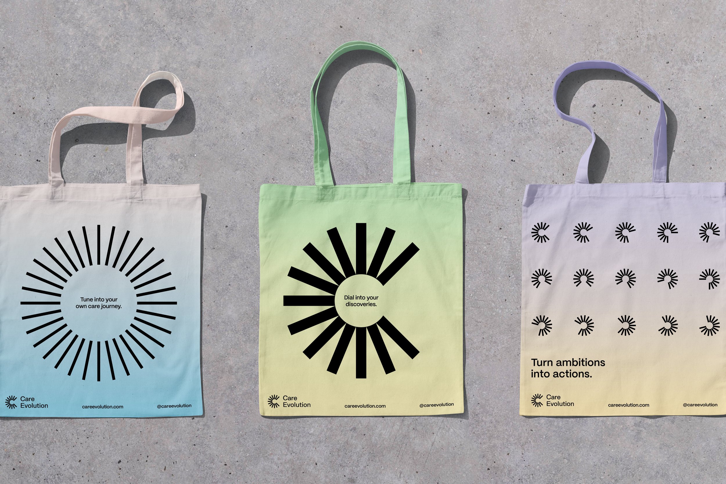
marketing assets—social media templates, website, swag
the careevolution sales team was embarking on a year of ambitious sales goals and they needed to be able to bring the new strategy and sales pitch to life in deck materials. so we created a branded deck template. never the sexiest design asset, but always the most hardworking, especially for sales teams who need to pitch to giants like athena health and apple.
at careevolution, product developers often need to play product designers so we created Generative design tools to make the brand easy to execute for those who’s main role is not visual in nature.
an active brand means that ever element is intentional and useful. On the right you can see iterations of their new logo expressed to showcase their different brand behaviors which all tie back to the strategy—connecting people to shape healthier futures—and what they do with data to make that possible.
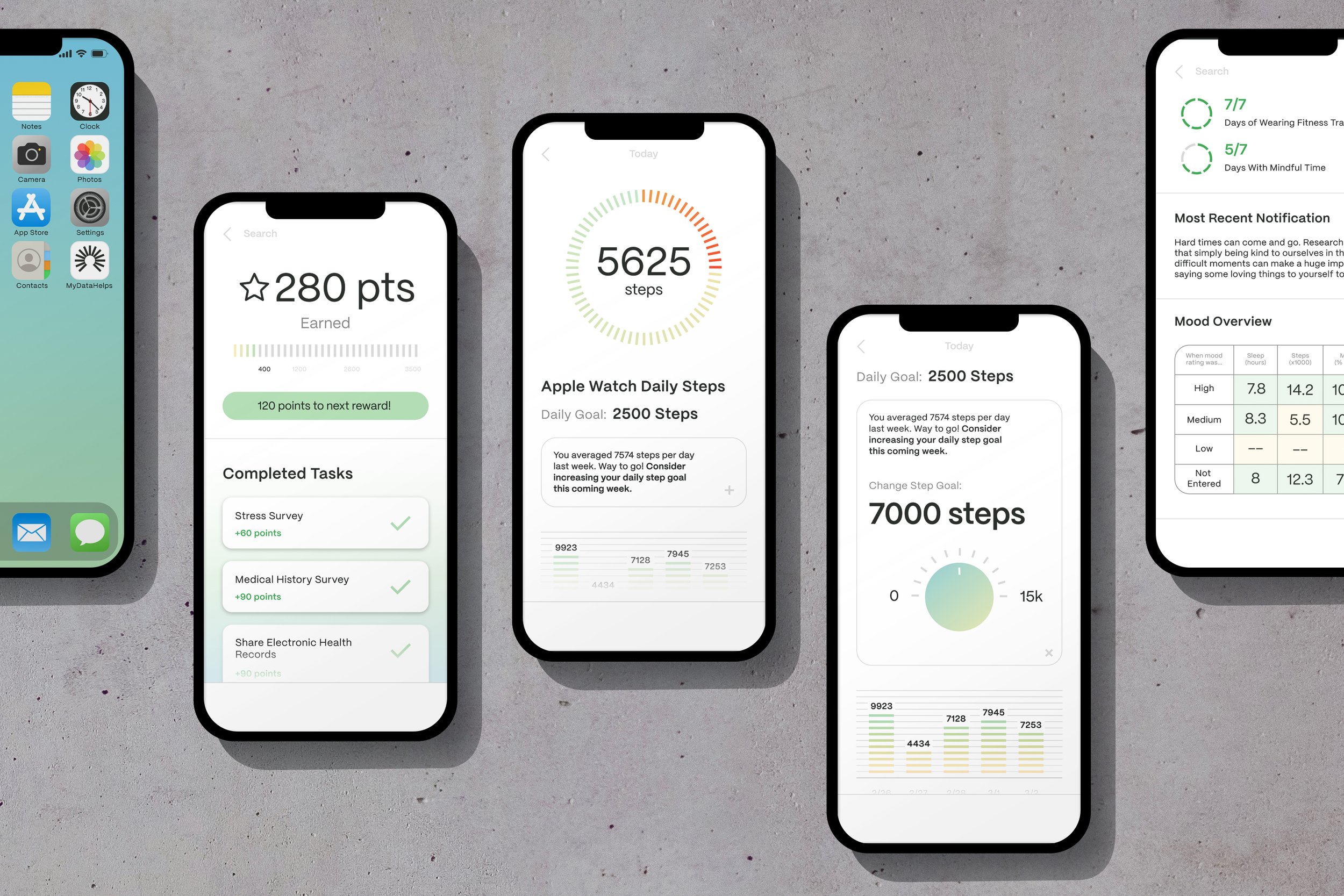
As a product-first company, careevolution needed an active, product-centric brand identity. so we crafted intentional UI elements for their product developers to test in the app experience.


perhaps our most ambitious deliverable of the entire project—careevolution’s new Wordpress website. while it is only part of a multi-phase effort, we designed a new site so that careevolution could show up to their upcoming healthtech conference with a fully redesigned web presence. the proto team managed content strategy, wireframing, UI design, visual application, and a tight working relationship with our dev partners at igicom.
careevolution’s design team was small, but needed to redesign execute a lot of touchpoints to turn the brand identity over. so we supported their efforts with example creative and design templates that they could use in figma to design at the pace of their monumental change.
kate’s role: director, head of verbal design, co-leading strategy and brand architecture with sr. innovation strategy director, arunima agarwal. and co-leading brand identity design development with proto’s chief design officer, mike rigby, and head of brand design, ryan atkinson.
